Data Visualisation Advice to Stop You Drowning in the Numbers

How to engage an audience when data is your story and the fact that data needs context in order to mean anything are two areas that Jude Barak has previously written about for us. In this piece, the third in the series, Jude explains the importance of presenting data in a format that is easily understood by the people who ultimately will be basing important decisions on it.
Let’s start with the basics
Data Visualization is a subsection of visual communications. It is also a relatively new field that combines knowledge from three paradigms that, on the face of it, do not seem related: analytics, design, and psychology. To understand how Data Visualization evolved as an independent realm of knowledge, I would like to begin with a little about visual communications.
The Evolution of Visual Communications
Visual communication is ‘a form of communication through a visual aid, and described as the conveyance of ideas and information in forms that can be read or looked upon. Visual communication, in part or whole, relies on vision’ and, its essence is using easy-to-understand forms of representation to share ideas, knowledge, and information.
People have been communicating using visual information since the birth of humanity. Take for instance prehistoric cave paintings. These paintings, as forms of communication, came long before words and language. Painting what they had in mind, or what they wanted to achieve, prehistoric people communicated and cooperated without using language.

Similarly, maps, schemata, and images (which are associated with modern science), also date back to the same era. Moving forward a few thousand years, think how difficult it is to describe a continent – its shape, borders, countries, etc., and how easy it is once information is represented in the form of a map. Here’s an interesting perception from 1870.
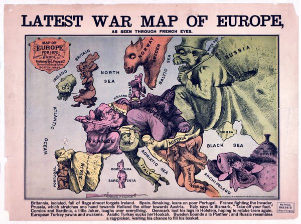
Large detailed Latest War Map of Europe 1835 – 1875. Image courtesy of maps-of-europe.net
I remember how bored I was in elementary school when my teacher spoke about the oesophagus, the stomach, and the duodenum. I remember how my brain tailed away while trying to figure out the origin of the words… But once the teacher pulled out an illustration of the human digestive system, I was intrigued. The picture showed what each organ looked like; described the relationships between the organs; and how together they form an awesome, complete, mechanism. I was fascinated! Since I’ve always had a strong visual memory, I can still vividly remember the illustration from many years ago, but can’t recollect if I ever knew the origin of the word duodenum.

Image courtesy of scioly.org
Scientists, even before they were called scientists, (the term was coined by William Whewell in the 19th century), acknowledged that to understand how things work they should be visually represented. It’s not for nothing, therefore, that some of the world’s greatest scientists are also among the world’s greatest artists.
The Change in Data Presentation
Traditionally, economic, financial and business data were all shown using lists, sometimes with, and at other times without, a summary or conclusion. This information was prepared by finance and accounting executives, or as I call them ‘numbers people’ – people who make decisions based on numbers; feel comfortable around and with numbers; and know how to produce numbers – their way.
Before the technological revolution, and before the world had become a global village, we did not need that many forms of visual communication. Back then, there was not much to understand other than a few sections of numbers – an income and expenses summary; a list of suppliers; another for clients; an updated inventory; some analysis regarding investments, profitability, and risk; and a bottom line. These not very many numbers told the whole business’s story. Then the technological revolution and its advancements changed the way we live, communicate and do business.
The transition to a digital world brought masses of available information and a plethora of tools for analysis and presentation. As a result, managers and businesspeople began using charts, graphs and electronic spreadsheets to make decisions. But the more data and information available, the more difficult it became. Today, to separate the wheat from the chaff and extract the data a business needs for making the same decisions, managers need to go through never-ending electronic spreadsheets, templates, and complicated algorithms, which makes it extremely difficult to see the forest for the trees.
At the same time decision-maker parties also underwent change. Previously, business decisions were exclusively made by the ‘numbers people’. Today, all business executives make decisions, which leads to another challenge. Often, marketing and sales people do not understand the language financial people use, and similarly, people in logistics have an altogether different language to that used by HR executives. Adding to that is the fact that some people, for whom numbers are not their bread-and-butter, feel uneasy around numbers, especially as they become long and complicated.
Also, living in today’s fast-paced world requires lightning-fast decision-making. If in previous years making decisions would wait for the quarterly or annual report, today decisions are made at every given moment.
These trends, developments and advancements brought about the understanding of how important visual information is in the decision-making arena.
Data Visualization – an Amalgamation of Analytics, Creativity and Neuropsychology
Meanwhile, another discipline secretly emerged. A discipline that combined two seemingly different content worlds: the world of numbers, logics, and analysis; and the world of visuals, creativity, and art. What eventually connected the ‘creative’ and the ‘analytic’ was science – some will say semi-science – since it was the humanities – sociology and psychology based on neuroscience research – that showed that final decisions are emotionally-driven.
Decision-makers will always want to justify the decisions they have made, especially when it comes to business. This amalgamation between the ‘creative’ and the ‘analytic’ helped the business world acknowledge that decision-making processes have more to them than just numbers and spreadsheets. However, to make the right decision, information needs to be eye-catching, simple and straightforward, and the context clear and comprehensive. And so, the best way would be to use the same methods science uses, which are also the same methods used thousands of years ago, namely, maps, illustrations, and images.
Here’s an example
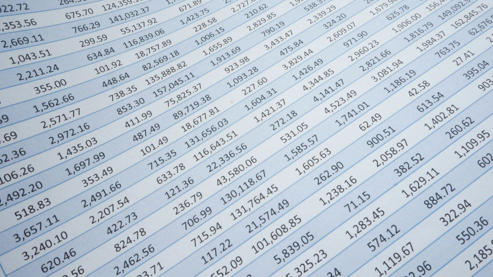
A European enterprise’s management convenes to decide on the distribution of resources among its branches. The presenter, the CFO, wants to cut back on resources provided to those branches not showing a profit. VP Marketing does not agree with the CFO and would like to increase marketing budgets to the branches that are not making money. The management needs to decide. What will they conclude based on the following report?
Some committee executives may feel it is easier to agree with the CFO since they might feel uneasy (even unconsciously) with the information provided – what are they supposed to make of it…?
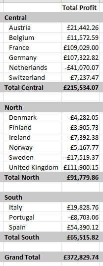
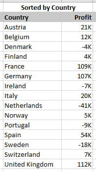
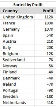
Another way to present the same information would be by countries and in alphabetic order. This representation is a bit more user-friendly, but still, what, if anything, can the executive committee conclude from this chart?
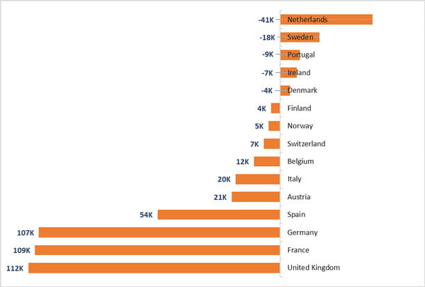
Wouldn’t this be better?
And while we’re at it – why not like this?
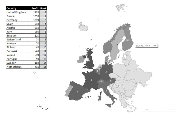
Even a map showing the rankings can often illustrate geographical trends more clearly than the original listing by region:
Decisions will most likely be made following a discussion, yet not before the executive committee has heard out both parties’ arguments, and have got the whole picture.
When seeking insight, we should always turn to visual. One picture is worth a thousand words and surely more than many thousand numbers.
From the Prehistoric Cave Walls to Modern-world Walls
When uploading data on the ‘cave wall’, today known as the big screen in the conference room, I warmly urge CFOs to be generous with their visual forms of representation and bring along the map and the chart. Take my word for it, management will be much more comfortable making decisions based on visuals of this nature and quality.
As always, if you have any comments, questions, suggestions, etc. you are most welcome to leave a message here. We’d love to hear your thoughts.
Jude Barak
Latest posts by Jude Barak (see all)
- Data Visualisation Advice to Stop You Drowning in the Numbers - 11th July 2017
- Data Needs Context - 14th March 2017
- How to Engage the Audience When Your Data is the Story - 19th January 2017