13 Pro Tips To Ace Your Keynote Presentations
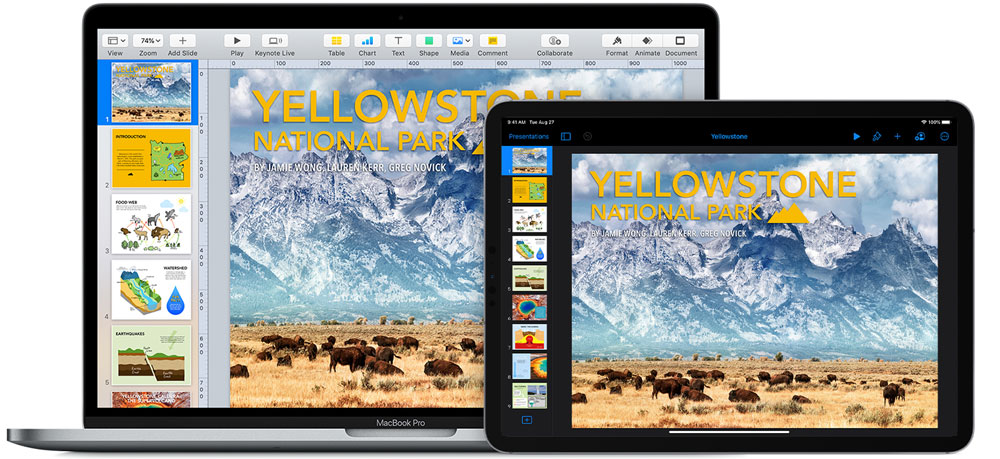

If you are one of those 588 million Apple users worldwide, own a Mac and use iPhone and iCloud; then you’re no stranger to the Apple ecosystem and its own exciting presentation software called Keynote. However, you still might not know how to use several tools that can make your presentation appealing. For students and teachers, Keynote should be a go-to presentation tool because the iOS version gives you a desktop experience that rivals can’t compete.
Before coming to the questions you need to ask when editing presentation content, we are sharing some fantastic features of this popular PowerPoint alternative you might now know. For the next time you’re on stage for any presentation, make sure that you incorporate these sixteen keynote tips and create a killer slide deck to impress the people you are presenting to and stand out among all the presenters.
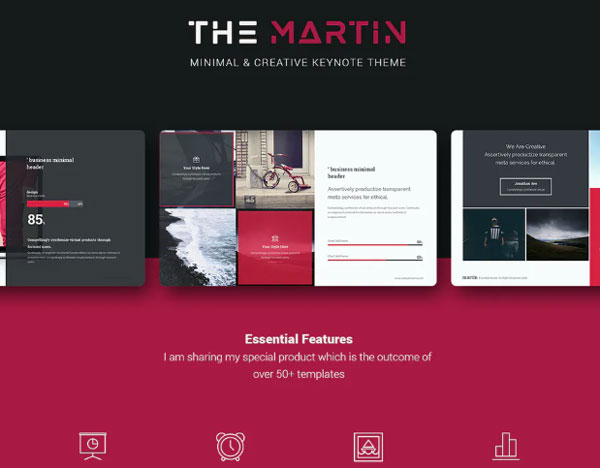
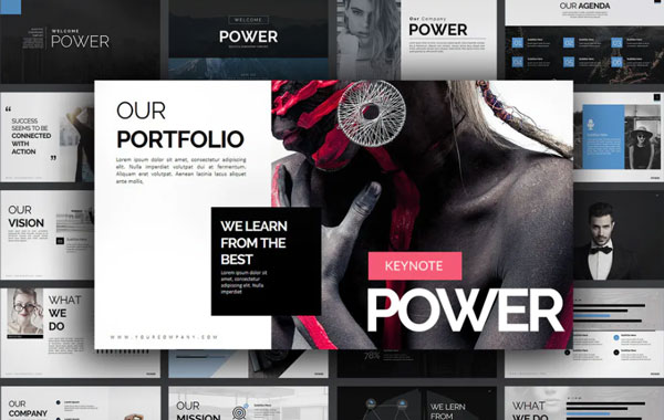
1) Use a Pre-Built Template Design
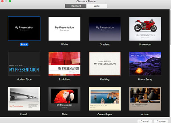
If you are worried about your upcoming presentation assignment and you are out of ideas, then don’t hesitate to choose keynote presentation templates. Using the pre-built Keynote templates will save your time as you don’t need to download PowerPoint or third party templates. Apple has designed its own range of templates with a powerful and aesthetic feel. Since Keynote software application is designed by Apple, you’re not going to find similar template designs on Windows or any other operating system.
Also, they give you a quick start to create an eye-catching presentation as you get your hands on numerous layouts, tools, and elements to use quickly. It’s a plus point because most of the themes and templates in third party apps have been used in countless projects. You can always check out this article for some alternative powerful presentation formats.
The appealing themes and tools can help you to develop a consistent story. It is important to choose a template that fits with your story.
Bear in mind that minimalism is the new trend. If you don’t know how to create your first Keynote presentation professionally, go for minimal and modern templates that you can easily manage. You’ll find numerous Apple Keynote templates with a clean outlook and elegant aesthetic. A simple skewed photo in the middle of the screen with plenty of white space on the right and left gives you enough room to combine decorative elements with elegant typography.
You can design your own template design or customized supportive slides. If you simply want to add new slides in a template, make sure that they match with the original keynote presentation that you selected on your own.
2) Customize Your Toolbar
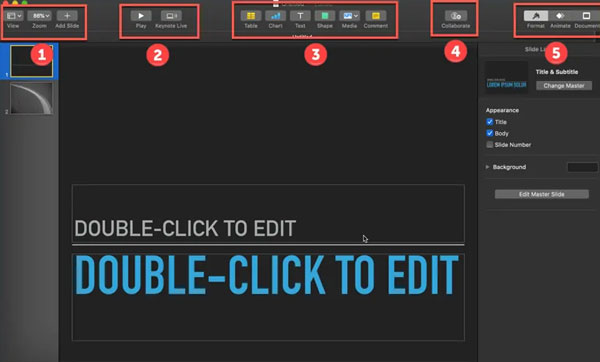
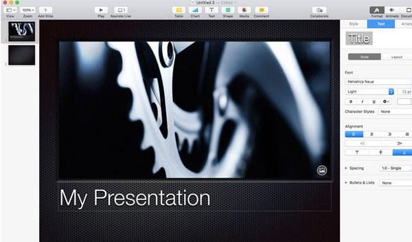
If you go for a head-to-head comparison of PowerPoint vs Keynote, you will know that navigating the workspace in Keynote isn’t hard. But a lot of times, the default toolbar does not have the feature we frequently use in our presentation, and you have to go to the menu bar to pick the desired tool, which makes things hectic for you.
Now you don’t have to open your menu bar again and again. Simply go to view and select the customize toolbar option and a box will appear where you can drag and drop your frequently used option. For example, if you find yourself repeatedly using charts, add a slide, and adjust image options, then you may want to add them. The best thing about a customized toolbar is that you can always undo it and return to the default settings.
3) Choose A Set Of Icons & Stick To It
A common mistake that most students do is using multiple different icons and symbols in their presentation. It is advisable to use a single set of icons matching with your theme and stick to them throughout. Apple has terrific icons that you can play with. According to presentation experts, when we use the same set fonts and illustrative elements, our entire presentations look cohesive even though you use different designs in each slide.
While this point makes sense, you have to be careful about the selection of icons. Make sure that the combination of a collection of icons wide enough to cover the essential needs of your topic. If you have limited content and the topic is more self-explanatory, then you don’t even need icons. Enlarged bold fonts are enough.
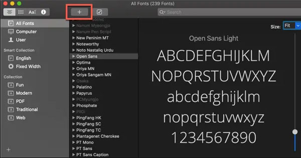
4) Pick Your Font Pair
It looks like the easiest and fun task, but it is not. Why? Because the font you choose can impact the readability factor. And what is the whole point of presenting to an entire bunch of people if they can’t read what you are showing to them? Not only this, but the fonts you use also leave different impressions on your audience. Some fonts are professional while some are funny and even scary-looking.
Therefore, select clear and comprehensible font sizes. It is recommended to use easy-to-read standard fonts like Helvetica or Cambria. But if you really want to add some decorative element in your presentation, then pair your standard font with Freestyle Script or Lobstor font, which best matches with its look.
5) Use Text To A Minimum
Now you’ve selected the appropriate fonts; it is essential to make sure that you put less text in your slides regardless of the presentation software you use. If your presentation is about a research paper and you don’t know how long an abstract should be, then don’t worry. You don’t need to add paragraphs. Nobody wants their audience to read out the screen.
If they start reading, then there will be no reward for them to listen to you. Therefore, you should avoid adding extra information and additional features because it will only make your slide look wordy and messy. You are up on the stage to speak, and the people sitting in front of you want to listen.
6) Make Visuals Your Friend
You must have heard that a picture speaks louder than words. Imagine your presentation slides as pure audiovisual material. Adding imagery in your presentation is top tip for creating an engaging virtual presentation. It makes it more appealing and increases the recall rate of the audience. Always use images and illustrations that can reinforce the message and help the listeners understand the main points. The right pictures can tell their own story and, this way, you don’t need to put much effort into explaining your position.
With Keynote, you can customize your slide by playing with images. Simply drag the image from your Mac and drop it on your presentation screen. Another way is to go to your toolbar, click photos, and select the image from your photo gallery and drag it on your slide.
7) WOW The Crowd With Animated Effects
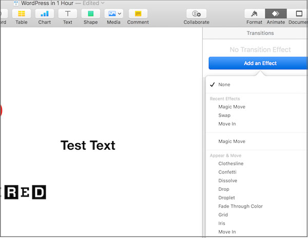
Who doesn’t like animations? In fact, they bring liveliness in your content, and they are powerful enough to add consistency to your story and make it more captivating. If you want to add animation as you move from the current slide to the next slide, click on the ‘Animate’ button, and you’ll see some options on your screens. The four options are;
- appear and move,
- object effects,
- flip, spin, & scale,
- text effects.
If you need these effects on any object or picture, then click on it and choose the animate option from your toolbar. You have the option to adjust the color, delay, duration, and more of your chosen effect.
8) Use Text Boxes
If you own a Mac, then you probably know that Keynote presentation software is preinstalled in Mac and is free to use. To use features available on Keynote and make your presentation beautiful, you don’t need to be a graphic designer. For example, you can use the textbook option from the toolbar, and this way, you can give particular space to essential points on your slide. You can also use textbox when you have less space, or you don’t want to increase the size of your text from the rest of the body text.
Textbox allows you to make important points, and statistics pop out from the slide without the need to increase the text size or make it bold. As long as the text is placed in a textbox or highlighted with a different color, it will be viewed as crucial information.
9) Add Catchy Illustrations
If you want to add the magic of creativity in your presentation, add unconventional illustrations and infographics. They are powerful and add an intuitive sense of informality to your presentation. You can even add comments and illustrations drawn by your hand on your iPad with Apple Pencil.
10) Don’t Be Afraid To Try Colors
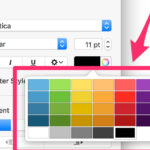
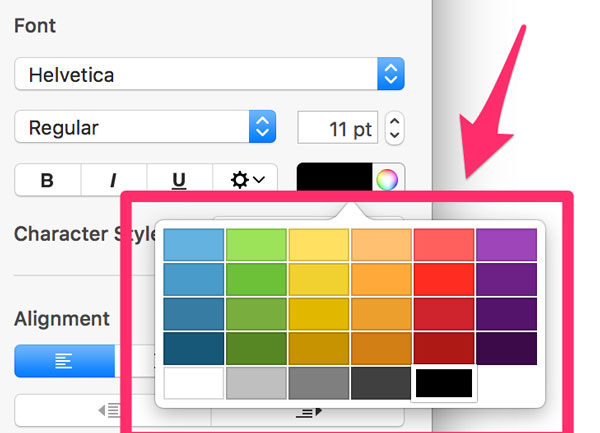
The biggest myth is to stick with a single color, or your presentation will look like a clown. With Apple Keynote, you will get versatile presentation templates that are not based on one or two colors. The premium themes have unique modern texture designed with larger color palettes. The best thing about the color palettes is that the colors are vibrant, with huge color mixing options. You can create your customized color palette, just like the toolbar.
All you have to do is open the ‘Color Picker’ and create your own color scheme for your project. In case you are out of ideas, choose a default color palette from the list and try it.
11) Edit The Slide Or Change The Look
You can change the whole outlook of your presentation if you feel that the design and the content are a mismatch. You can discard your old theme at any time and pick a new one. Just click on the document button and go on the change theme option. The good thing is that while changing your theme, you have the opportunity to keep the customizations you’ve made previously. For example, if you don’t want to change the theme but keep the text color, then click on ‘keep your style changes.’ Moreover, if you feel like going back to your old theme, then you can always undo it. You have both options.
12) iCloud Keynote
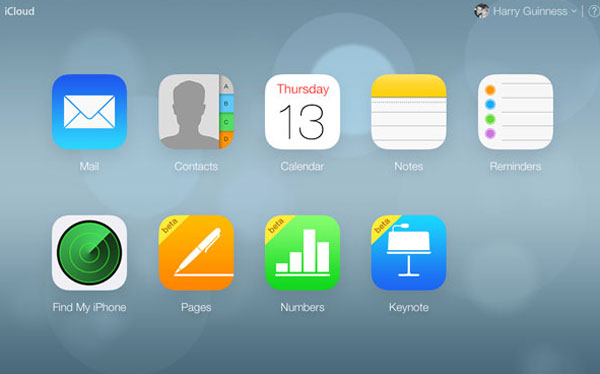
Now you can work on your presentations on any Apple device. With Apple Keynote presentations, you get the ability to store and edit your slides on other Apple devices. To do this, you need to open your Mac and sign in to iCloud. As soon as you enter your Apple ID and password, your Mac will be connected to iCloud, where you can save every data, including documents, photos, contacts, and Keynote presentations. This means that you can create your original Keynote presentation on Mac continue editing on your iPhone while lying on your bed.
13) A Lot Of Practice
Last but not least, good things take time. If you consider yourself as an experienced speaker, then let us tell you that even the renowned keynote presenters prepare for a speech months before. So, if you rehearse exhaustively, your chances of success would increase immensely. Practicing allows you to deliver the content in an interesting and helps you to pick the right clothing, gestures, hand movement, and even the time of appropriate intervals.
Don’t just read your presentation. You are big enough to understand that your audience is capable of reading, and that’s why you shouldn’t be reading the slide for them. Your presentation should provide you with a context filled with visual aid and illustrative elements. Take your presentation as an outline and build your arguments around it, just like you do in casual daily conversations.
It doesn’t mean that you shouldn’t read the content at all. But identify the right speed. It shouldn’t be very high or shallow. If you are reading out fast, it doesn’t mean that you are confident, but it means that you are nervous or lack presentation skills. Experienced speakers take regular pauses to emphasize the main points. And if you’re struggling, remember there are some amazing online apps to help you deliver killer speeches and presentation.
The Bottom Line
Apple users now have the opportunity to take their presentations to a new level with this fantastic Keynote presentation software. You don’t need to waste your money on buying online templates. Now, you’ve finally learned that Keynote is easy to use, start working on your upcoming presentations and amaze your audience.













free ppt templates
9th August 2020 at 2:52 am
thx for your share, these are all good advice, for starters, try using templates to quickly create a beautiful presentation, we have made a lot of professional and customizable presentation templates, ready to download and use.