3 Signs Your PowerPoint Template Is Broken and Why


The chances are very high that the corporate template you’ve been forced to use all this time is designed to fail.
Now you might be wondering, “My company spent a lot of money hiring professionals to produce our template. How could it be designed to fail?”
The problem is twofold:
1) Your company didn’t spend the proper time thinking through the purpose of the template
A properly designed template is the product of considerable thought and planning. It takes into account the needs of its users, the purpose of each presentation it will create, and the ways in which it might be mis-used.
2) Your template’s designer doesn’t understand PowerPoint
Whether it’s been designed internally or by an agency, chances are that the designer of the template didn’t fully grasp the complexities of PowerPoint and how its templates are supposed to function.
Even big design firms who claim to be able to build PowerPoint templates, don’t really understand PowerPoint. Some even build everything in other software like Adobe InDesign and then transfer it over to PowerPoint!
That’s how they’ve inadvertently laid booby traps for you.
If you’re not sure whether your company template is broken or not, open it up and check it for these 3 tell-tale signs.
Broken Template Sign 1 – Resetting doesn’t reset
When you hit the Reset button (next to the New Slide button on the Home tab), nothing happens to the formatting of your slides (colors, fonts, layout, etc).
This means that you’re not using the placeholders set up in the template, which is why the Reset button isn’t able to do its job.
Now, this could simply be a user error (maybe you’re just throwing content onto a blank slide).
But it could also mean that the designer of the ‘template’ actually gave you what I call a Fake PowerPoint Template.
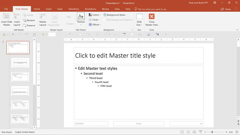
You’ll also be able to see this if you go to View > Slide Master and find that you have this default PowerPoint setup.
It doesn’t necessarily mean that your template is broken… but it’s certainly not a custom template that you have.
What you may have is a set of beautifully designed example slides created in the Normal View, but not tied to any real PowerPoint template.
Broken Template Sign 2 – So many Slide Masters
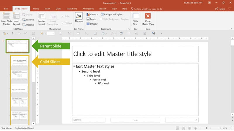
Open up a recent presentation and go to the Slide Master (go to View > Slide Master). How many Parent Slides do you see?
In theory, you should only see one Parent Slide (except if your template started out with more than one).
If there is more than the expected amount of Parent Slides, it may be that your template is broken (but not necessarily).
The next step is to see if the names of the child layouts of your Slide Master have been renamed.
To do that, either hover over the layout in the Slide Master View or open up the Layout options in the Normal View.
If the names you see here are radically different from the default PowerPoint ones (as pictured above), it may be causing your template issues, which is why you have lots of new and unnecessary parent slides in your Slide Master.
This leads to a bloated slide deck and to confusion for your users.
What probably happen is that when you pasted in a slide from a presentation with another template, PowerPoint didn’t know which layout to attribute it to. Therefore, it just added the entire presentation’s Slide Master layouts into your template.
Broken Template Sign 3 – Funky things
Your template is starting to do some strange things that don’t happen when you try them on a default PowerPoint template. These can include:
- If there is a title, and no subtitle, on hitting Reset (next to the New Slide button), the title becomes the subtitle.
- If there is no title but there is text in a content placeholder, on hitting Reset (next to the New Slide button), the text becomes the subtitle.
- You keep getting an error message that says there are missing fonts in the presentation, but when you search for the font, it’s nowhere to be found.
Now before you go and rebuild your entire corporate template, let me quickly list some common issues that DON’T mean that your template is broken. These include:
- Your slide numbers aren’t appearing as they should (see this tutorial for how to get your slide numbers to appear properly).
- When you insert a new shape, the formatting (text font, colors, etc.) don’t match the formatting set in the Slide Master and in the theme. Find out how to sort them here.
What to Do if Your Template Is Broken
If you’ve discovered that your corporate template is broken, you have two choices: you can either try to fix it, if it’s a small problem; or you can rebuild it from scratch entirely.
Determining which choice to go with will depend highly on each template and situation.
If you’re the only person using the template and you’ve only spotted a few small issues, then I would recommend simply making those adjustments and then re-saving your template.
However, if your template has been circulating for a long time and is being used by many people already (10 or more), I’ve found that it’s often easier to simply restart the process.
And in any situation, if you notice a lot of funky issues in your template, like error messages and mystery shapes, I highly recommend building your template again, from scratch, to make sure you nip the issues in the bud.
If you liked this, you might also like
Why You Need to Invest in Creating Professional PowerPoint Templates
A Recipe for an Efficient Corporate PowerPoint Template


Camille Holden
10th August 2018 at 4:42 am
One other thing – be careful about embedding fonts, especially when going between Mac and PC, as they can really mess up your presentation. Hope you find this article helpful!
Sandy Johnson
21st August 2018 at 10:08 pm
This is awesome, Camille. I’m sharing on social media.
Rosie Hoyland
23rd August 2018 at 1:32 pm
Thanks for the share, Sandy – it could be a really useful guide for so many people!
Camille Holden
23rd August 2018 at 4:03 pm
Thanks Sandy!