The Best Way to Annotate a Graph


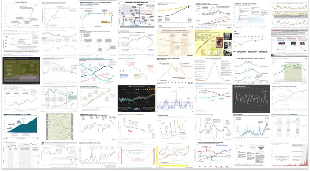
A good graph will make its story quickly and clearly and how you annotate it will be a major part of telling that story. Clutter confuses and makes it difficult to see the wood from the trees, whereas simplicity enables clear and direct attention.
Bruce Gabrielle, author of Speaking PowerPoint: The New Language of Business and the soon-to-be-published Storytelling with Graphs, shows us exactly what the 10 rules for good text annotations are with a well illustrated step-by-step makeover that perfectly illustrates his logic.
Check out his very convincing graph makeover here: 10 Rules for Graph Annotations


Richard Garber
26th February 2018 at 8:04 pm
I dont’t think this is the best way. It would be better to break that slide into six simpler ones, as discussed on my blog post.
Rosie Hoyland
27th February 2018 at 9:15 am
Thanks Richard – you make a fair point about slidedoc versus presentation slide. It is important to consider where your graph is being used and whether or not the readers are having to interpret the slide themselves or if there will be a presenter walking them through it. Only once you know the scenario can you decide how to make it as simple as possible for the reader to understand.
Andrew
18th June 2018 at 9:21 pm
The link (10 Rules for Graph Annotations) does not work…Could I get that still?
Rosie Hoyland
19th June 2018 at 9:03 am
Hi Andrew – thanks for pointing that out. I think the source site had changed their links but I’ve managed to find its new location. If you click through now it should work.
Chris Buckley
17th October 2018 at 10:04 am
Link has changed again – http://speakingppt.com/10-rules-for-graph-annotations/
Rosie Hoyland
17th October 2018 at 11:06 am
Thanks for letting me know – I’ve updated it so folks can still see the great examples it describes.