Death by PowerPoint? Why not try The Better Deck Deck?
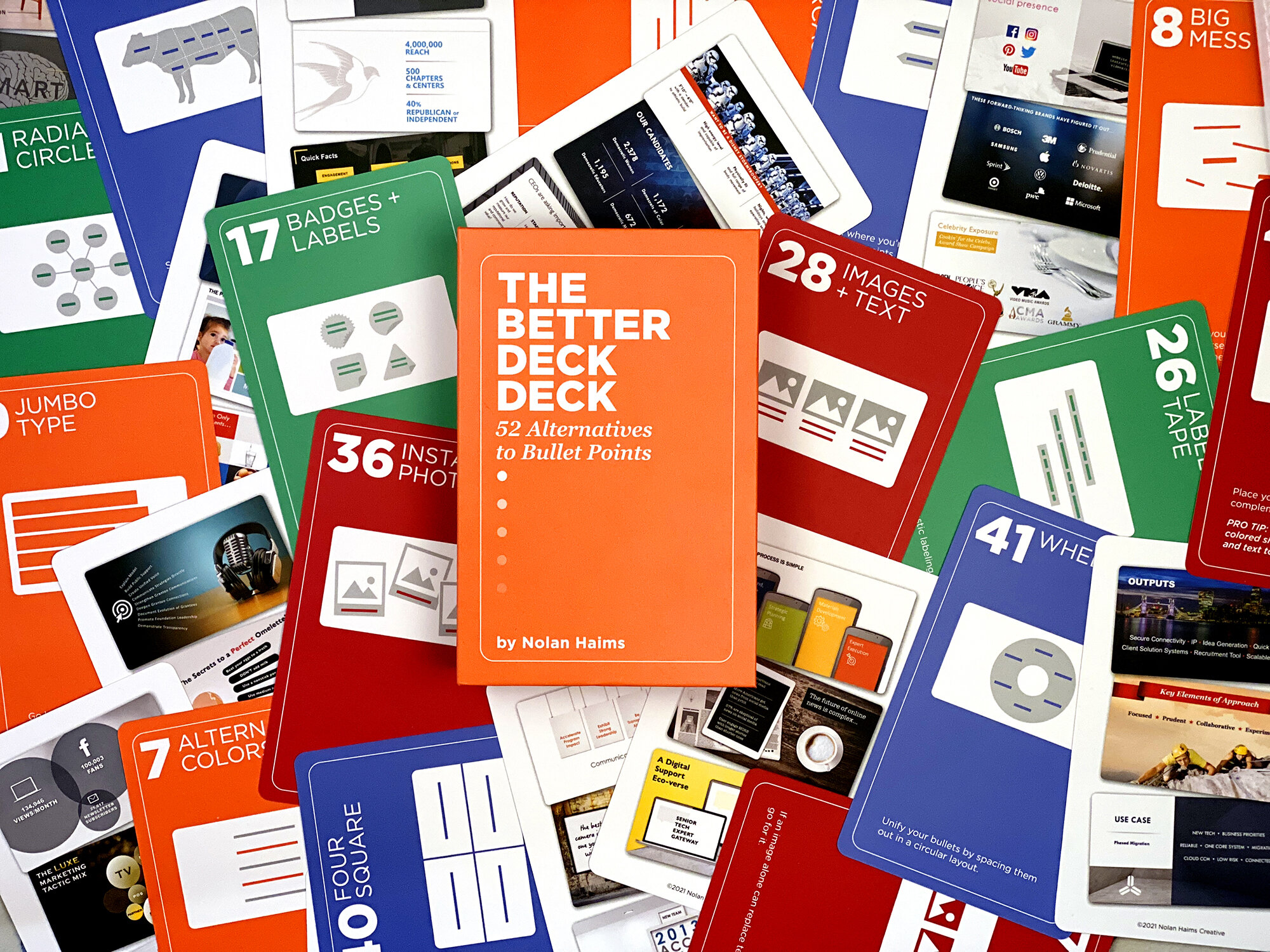

Sometimes professional presentation designers and everyday presenters like me need inspiration. From time to time, when you sit down to make a set of slides to emphasise and illustrate your speech, you find that you are bereft of ideas. Call it ‘designer’s block’ or whatever you want, everyone who has ever been up against it, with a deadline pressing, and not a thought in their head as to what they might do, will understand how valuable a little box full of hope might be.
This product is a little box of hope for all of us who would rather use mime, origami, or anything other than endless bullet points when we stand up to speak.
*NB. We haven’t been paid to endorse this product. We reviewed it because we love it and we think that our readers will find it useful.
It’s made by Nolan Haims
Nolan Haims is a magician. He really is. He performed with the Moscow State Circus and toured the US with the Circus Smirkus before he decided to drop his juggling clubs forever and lay aside his deck of playing cards for a different kind of deck.
He became a graphic designer (how many people left the circus for that?) and then specialised as a presentation designer. He’s one of the USA’s 15 PowerPoint MVP’s (which means he knows his stuff) and he runs a successful business helping organisations large and small tell their stories with impact. He’s also a good guy. I first met him about 8 years ago at a Presentation Conference in the USA, and we chatted over beers and Bellinis. I’ve followed him online ever since.
What’s the big idea? Inspiration when you need it most
When I saw that he’d launched a new product, The Better Deck Deck, I had to take a look. He sent me the physical product, which is a beautifully made box of cue cards that are designed to sit on your desk and offer inspiration to you when you’re working on your presentation slides.
Who is it for? Pro-presentation designers and mere mortals like me
Presentation designers are often faced with a deck to deliver to a deadline. In front of them is the deck that the client has sent them to transform. That set of slides often consists of little more than page after page of large blocks of text or a succession of dull bullet-point slides.
It’s pretty much the same for amateurs like me. Our first draft of a presentation tends to be like the designer’s starting point. We’ve outlined our story and created a storyboard of headlines, text, bullet points, and not much more.
We want to create an interesting and simple set of slides that do us and our message great credit but, unlike the designer who understands the fundamentals of slide design, we tend to trust the template, the SmartArt, and the layouts, or (comically) think we can do better without any of it.
The professional designer needs occasional inspiration; the non-designer needs that and some structure to avoid the ‘home-made’ look of so many amateurs’ efforts.
What do you get? Literally hundreds of inspiring examples of ‘much better than bullet-point’ slides
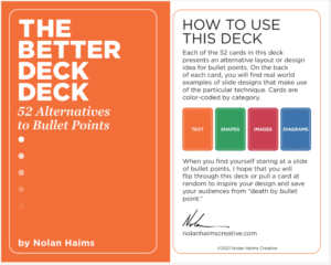
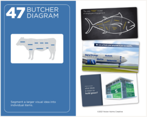
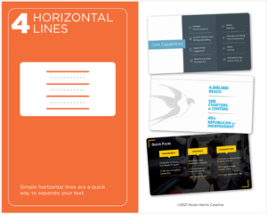
The front cover of the pack promises ’52 Alternatives to Bullet Points’, but I think this is wrong, because there are 52 cards, but each one offers ‘real-world examples of slides designs that make use of the particular technique.’ How does it work? 4 types of slide, 13 samples of each type, and 3 real-world examples.
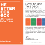
Nolan explains how each of the 4 types of slide can be used to replace the ineffective bullet-point cliche:
- Text
- Shapes
- Images
- Diagrams
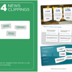
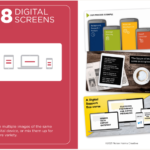
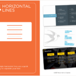
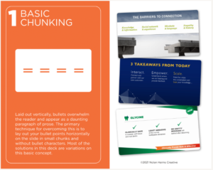
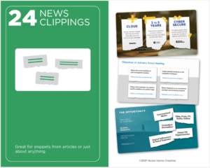
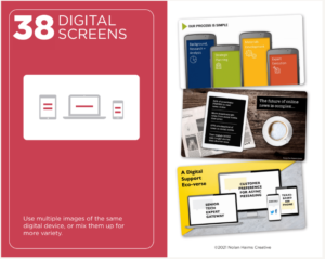
The cards are colour-coded by each type and then each card gives a little advice as to how to use the type, with 3 real-world examples.
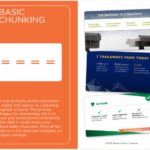
Here’s one from the ‘Text’ type
Here’s one from the ‘Shapes’ type
Here’s one from the ‘images’ type
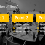
Here’s one from the ‘Diagrams’ type
Does it work for a non-designer like me?
Here are three examples of how the deck helped me to design good-looking slides from a blank template
Example 1
Here’s the example in the deck:
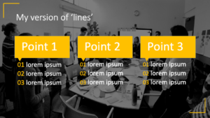
Here’s my version:
I created a slide, changed the background and added the corner pieces in Slide Master, then used SmartArt for the layout. I converted the SmartArt to shapes and tweaked it. Took 5 minutes to do including the template changes.
Example 2
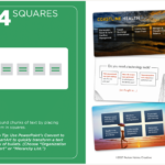
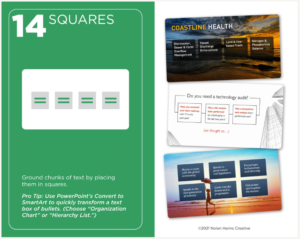
Here’s the example in the deck:
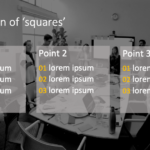
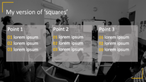
Here’s my version:
I used the same template I created for the first example then used SmartArt again for the squares, then formatted the graphic using the SmartArt tools – 3 minutes.
Example 3
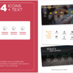
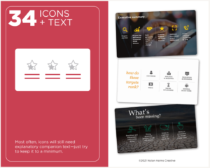
Here’s the example in the deck:
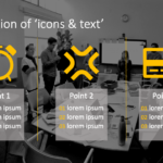
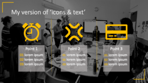
Here’s my version:
I used the same template I created for the first two examples then used SmartArt again. I chose one of the picture layouts, added PowerPoint icons and then converted the SmartArt to shapes once more and tweaked it. It took 5 minutes to do.
How much does it cost?
$29.95 for the physical version that you can put on your desk and explore every time you need it and $14.95 for the PDF download edition.
Is it worth it?
Yes, yes, yes and 156 times yes, because that’s how many examples you get in the pack. That’s a whole lot of inspiration for all of us, and for much less than one of the Bellini’s that Nolan drank in Las Vegas.
In Summary: Inspiration for PowerPoint users every day for the price of a cocktail
The toolkit helped me go from Nolan’s idea to a professional-looking design using only PowerPoint and its tools. The layouts look good even after I’ve ‘interpreted’ them, and better than what I’d have achieved on my own.








Tom Caklos
12th December 2021 at 12:44 pm
Wow! Thanks for sharing this amazing resource Jim! I went and immediately wanted to checkout – but the issue is that I am based in Slovakia (eastern Europe) – and shipping costs the same as the product itself haha. But I am definitely adding this my “shopping bucket list”! Great stuff Jim!