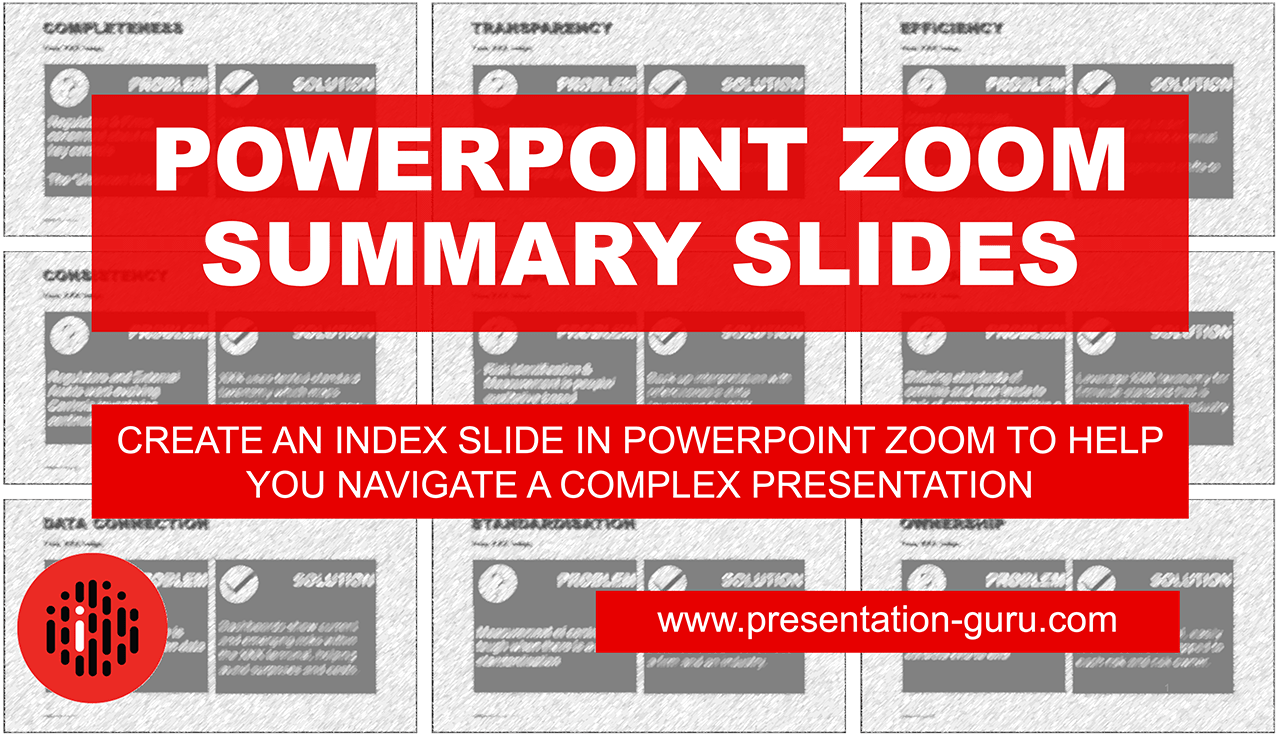
Powerpoint Zoom Summary for interactive presentations – everything you need to know


In this article I’ll be showing you how you can use Powerpoint Zoom to help you navigate your slides brilliantly in complex presentations. You know the kind, those times where there are many possible places to start, depending on the audience’s needs and you want to be able to navigate smoothly from section to section and back again without exiting presentation mode. Here’s how to look in control, confident and capable every time. We’ll take you through PowerPoint Zoom from its simplest concept to the most customised examples. Here we go!
What is PowerPoint Zoom?
- It’s a way to navigate between individual slides or whole sections in your PowerPoint deck that allows you to skip to whatever slide that you want – and back to the same starting point – automatically.
- You can easily create an index slide for a multi-chapter presentation and start and return to the index slide repeatedly.
- You can create all kind of zooming effects (hence the name) but avoid the ghastly spinning and falling effect of Prezi.
For complex presentations – you want the flexibility to start anywhere:
I was working with the fabulous John Zimmer in Madrid this week. Our clients were ESG Global, a superstar SAAS software business that makes state of the art data collection, billing control and energy optimisation products for the energy industry, all over the world. We were talking about sales presentations and the things that speakers can do to use their slides effectively, especially when the audience might want to start in different places in a multi-slide deck. The question that so many speakers ask when we talk about presenting in the ‘real world’ came up:
‘How can I prepare a set of slides when I don’t know what the audience will want to talk about?’
The answer (Researching your audience before you meet them is, of course, a very good idea as a foundation) is: create a really flexible set of slides that you can navigate through, utterly seamlessly – forward and backwards.
PowerPoint was designed as a linear storytelling tool:
PowerPoint offers us a mostly linear approach to story telling, in that we tend to start at slide 1 and move forwards and backwards from there. There have always been hacks you could use when the audience wants to start at section 3 of your slide deck, but they were tricky and not widely known. You could use the presenter view, unseen by the audience.
You could just type in the slide number ‘XX’ in presentation mode and then hit ‘Enter‘, and you’d arrive at the right slide (if you knew the slide number of course!) . Or (more frequently) you’d could exit presentation mode and scroll through your slides to the right place and start the presentation again.
- The first method was easy but most people didn’t use presenter mode.
- The second method was fraught with danger (what if you forgot the slide number or entered the wrong number?) and
- The third just looked poor to an audience and felt awkward for the presenter.
Prezi changed the game for a while – PowerPoint Zoom is better
Then Prezi came along, and for a few years it seemed to offer an interesting answer for those of us who wanted a more flexible approach to navigating through our visuals. Prezi offered the ability to design a presentation in a non-linear way that offered hope to the more creative presenter. It worked for a while but it was easier to create a bad presentation with Prezi than with PowerPoint. PowerPoint duly responded to Prezi’s challenge, and the Zoom feature was added in 2016 as a part of the PowerPoint for Office 365 update. We first talked about it here.
Here’s the PowerPoint Zoom concept in one video:
Have a look at this simple video to understand how the Zoom index slide works in its most simple form. Then look at the later videos in this post to see how you can personalise this even more, and make the whole process invisible to the audience, and even expert PowerPoint users.
Now Create Fully Customised Zoom Summary Slides:
If you like the idea of Zoom summary slides, here’s how you can customize the feature to use any image or icon in place of the automatically generated slide thumbnails that PPT offers as standard. It’s the highest level of skill and it takes a little longer to do, but it’s worth the effort if want a really cool effect. Here’s a short demo (no sound), but skip ahead to the next video if you’d rather.
Here’s how you can make this slide type for yourself, step by step. Part one:
Part 2:
I hope you enjoyed this post. If you want help with slide design you can contact me in the comments below, and if you want to learn for yourself, I’ve even added the source files for these sample presentations for you to download FREE here. Good luck and happy zooming.


