The Secrets of Powerpoint – and How They Can Help You


This year an agency within the USDA is gradually rolling out their new presentation platform, a structure containing thousands of individual slide shows, tens of thousands of pictures, video, embedded documents, Web links and more. Their platform will service thousands of trainers, spread across all US states and territories. Everyone will have almost instant access to anything they need within that vast collection of content. So, how are they creating such a powerful platform and might something like it be available to us mere mortals using humble PowerPoint? What kind of software produces an outcome of that magnitude, essentially a huge “website” of slides with on-demand access? The answers to all these questions might surprise you.
I first met Cathy Carothers years ago while delivering a series of presentation workshops. She is a lactation consultant. I remember snickering at the time, “Who knew there was such a profession?”
But I’m not laughing now. After helping Cathy with what seems like countless presentation and training projects since then, I’ve probably seen more breasts at this point than most men alive—and certainly for a good cause, mind you. Cathy’s work is groundbreaking and important.
In this article I’m going to introduce you to her latest project and explore the presentation technology that powers it. It’s a federally funded 3-year grant that’s building the most marvellously visual and flexible presentation project ever made, to my knowledge anyway.
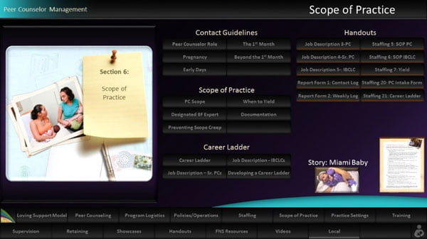
Trainers using the materials will start with title dashboards like this one …
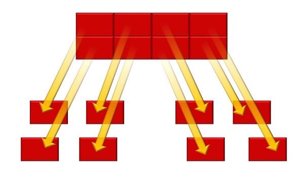
… and go from there to other dashboards, and then from there to content shows of choice—with many hundreds from which to choose.
I want you to see this project’s burgeoning development, not because you will be presenting lactation topics anytime soon—presumably—but because what Cathy is doing with these interactive presentation materials is something you and your organization can do with yours as well. You can build a similarly flexible, reusable, high-quality, on-demand knowledge reservoir, just like what I described above, and PowerPoint is the ONLY thing you’ll need to pull it off. It’s simply a matter of knowing how to creatively massage the software’s capabilities. You can get started right now.
To do so, you’ll complete four crucial steps. (And, by the way, these steps can be downloaded in much more detail via a free PDF Visual Language guide available here.)
Think In Modules
Most PowerPoint users are in the habit of making a single, long, linear, new presentation for each upcoming event, followed by throwing that show into the proverbial dustbin afterwards, where it likely never again sees projector light. Such thinking must change when crafting a reusable platform like Cathy’s. You’ll become a modular thinker and start tearing those old shows apart into many pieces for possible future new life.
Start by analyzing all past and current content, asking: “What individual topics do these shows contain?” Then physically divide those big beasts into smaller, separate slide shows, each focusing on one specific topic. Maybe you had 10 or 20 shows lying around before. Now perhaps you’ll end up with 100 or 200. Not surprisingly these new little jewels probably will feature only 5 slides, or maybe 2, or sometimes only 1. That’s just fine.
About now you’re asking, “Why go through such a hassle? Why does my overall message have to exist in tiny pieces? Because that’s the only way you’ll be able to instantly access single subjects on demand, when needed. It’s like going to the grocery store. Of course you expect being able to select individual products and place them in your cart, right? In the same way, a dynamic speaker must be able to select and display separate message components as they become relevant—immediately—rather than having to scroll through a bunch of unneeded slides to find desired content.
Think about this. Your old slide shows don’t have to end up in the dustbin. True, you may never deliver that exact same series of slides again, in the same context and for the same purposes. However, I’m willing to bet you may need some parts again, with a different audience a month or a year from now, maybe after someone asks a question about an issue you weren’t originally planning to address. Finding needed slides in that case would be a mess using the old linear way of thinking, but is quite easy once all message components are modular and arranged on dashboards for fast retrieval.
Learn How to Navigate
Speaking of dashboards, you’ll need those. Your speaking engagements from now on will resemble navigating around within a large website. Very few speakers even have a clue this kind of “power” is truly available in PowerPoint. It is.
Believe it or not, PowerPoint offers not just one, but four, different kinds of hyperlinks. You can navigate randomly between slides within a single show, or jump out to any other separate slide show. You can open documents, run animations out of sequence, make tables and graphs interactive, and integrate a host of other dynamic features. The possibilities are limitless. Most people would never guess the USDA platform mentioned is 100% PowerPoint-based because it does far more than merely display slides. In a sense, it acts like a content management system, giving access to anything—and I mean anything—a speaker might find helpful during a talk, including random selection of video and websites, playing audio as needed, and even onscreen drawing like is possible with digital whiteboards.
To give a taste of how this presentation style works, I’ll show you a typical dashboard structure. Unfortunately, I can’t yet go into great detail with Cathy’s project because final approval of the overall design is still about 2 years away and the feds are a little touchy about their protocols. However, I can show you the dashboards in my platform, the ones I use while conducting workshops. They utilize the very same design logic. I, as a mere mortal, normal dude, possess this technology just like you can.
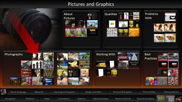
The screenshot here represents a dashboard full of all subjects I teach about working with pictures in PowerPoint.
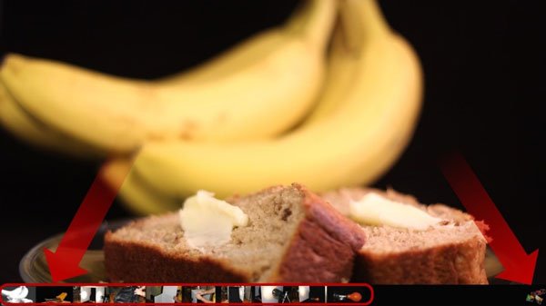
Each little thumbnail is an active hyperlink that opens an external slide show—meaning a PowerPoint show outside of the current one containing the dashboard. If, for example, I click the link indicated by the red arrow, that small slide show opens on top of the dashboard, completely covering it and displaying only the desired content.
Notice this show, likewise, contains a navigation strip at bottom allowing selection of any slide, in any order, at any time. To return again to the dashboard, I click a small button in the bottom right corner of any slide in the show. It acts like a back button in a website and takes me immediately back for additional selections.
Organize Your Slides
The methods I’m showing you, to the surprise and consternation of many, have been around for nearly 20 years now, obviously in much, much earlier versions of PowerPoint. That potential has been there all along, waiting for you to unlock it. The reasons more people haven’t done so are somewhat mysterious. Honestly I don’t know why they haven’t. What I do know, however, is that you may encounter a few perplexing barriers along the way. There are good and bad ways of building a presentation platform. I’ll shortcut the learning curve here and steer you away from the bad approaches from the beginning.
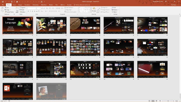
Your first task is mastering basic navigation strategies available in these free tutorials on the Aspire Communications site. Then you’ll build what’s called a primary dashboard show that serves as the platform’s central nervous system, so to speak. That show contains no content whatsoever. Its sole purpose is holding dashboards that give you access to other slide shows. Each slide is a different dashboard. Here’s what mine looks like in Slide Sorter View. Amazingly, this single slide show gives me fast access to literally thousands of other slide shows.
Finally, you’ll build all the individual content shows, a task I’ll discuss in more detail in a moment, and then link from the dashboard slides out to those shows. Your presentation activities end up being a back-and-forth movement from a dashboard out to a slide show, back to the dashboard, out to another slides show, and so forth. We call those small content shows visual vocabulary. In a sense the presenter stings them together as needed, on-the-fly, almost like spontaneously choosing words in a verbal dialogue. He or she has that much flexibility.
The most vital factor in this whole process is deciding how your speaking topics will be organized via those dashboards. Each dashboard features groups of related topics and you should be able to look through the dashboard names and pretty much immediately think, “Oh, yeah. I know where to find the show I need. If that kind of instant recognition isn’t the case, you may need to reconsider some of the platform’s organizational logic.
In my platform, I have a dashboard for picture-related topics as mentioned, and another for design topics, another for animation skills, another for working with video, and so forth. My dashboard categories clearly tell me where to find the subjects I need.
I’ll be honest with you. Figuring out ideal dashboard categories, although super important, tends to be quite challenging for most folks. Organization is tricky. No hand from heaven commands which links go where. You’ll have to figure that out on your own through careful thought and quite a bit of trial and error. I strongly recommend doing your initial planning on paper, or in some simple digital format, before ever building the platform’s structure and slide shows. That way you’ll be able to move items around in various arrangements without wasting time remodelling the real thing after the fact.
To get a handle on the organizational thinking required, imagine entering a large grocery store and trying to find a bottle of ketchup. What if condiments such as mustard, ketchup, pickles, and such were scattered haphazardly throughout the store? That would be a disaster. You’d never find anything. The reason you can find ketchup with little effort is because all condiment-related items are grouped together in a particular aisle. Think of that aisle as similar to one of your dashboards featuring related content.
Visual Content That Matters
The last crucial step is huge—comprising two books-worth of content in fact. I’ll touch on the basics here. Adding flexibility to your messages is a vital part of building a great presentation platform, but equally important in the quality of the content being presented. If you envision putting bullet points in those small external slide shows … stop reading right now and forget you ever saw this article. A presentation platform is not for you in that case.
The whole purpose of making modular, organized, randomly accessible visual vocabulary—those tiny, easily displayed slide shows—is actually showing people something that matters. Bullet points DO NOT MATTER. Bullet points are ugly. Bullet points are boring. Bullet points are unprofessional. Bullet points are worthless!
Instead, slides should contain meaningful visuals that directly help you in some way, perhaps showing examples of what’s being said, communicating analogies, contrasting one state with another, stirring up emotions, making people laugh, modelling intangible concepts, telling stories—something. I’m not talking smiling models in stock photos, stupid clipart, or androgynous white beings holding a magnifying glass or coffee cup. Seriously. Make slides that are worth people’s attention.
That’s a subject for another day but gather useful tips right away by perusing the other guide available here discussing Pictures Roles.
Audiences today are desperately crying out for speakers who can deliver conversational, down-to-earth, real, meaningfully visual talks that are tailored to their interests. Making that happen via a traditional bullet-point-filled, linear presentation is almost impossible.
You have the power to be better than that—exceptionally better. It takes work. There’s a learning curve. That’s life. It all comes down to whether you are content with being average, or aspire further. If the latter is the case, move in the direction of dynamic visual delivery. It’s a strikingly different way of thinking about public speaking and I think you’ll really like it.








Rosie Hoyland
27th September 2016 at 1:07 pm
This is brilliant! It just goes to show that so many of us barely scratch the surface when it comes to PowerPoint. It really can be a powerful tool if only more people were aware of what lies under the bonnet. Thank you Robert for bringing this to our attention – it has certainly opened my mind to a new way of managing my presentations.
Shane
22nd December 2016 at 11:42 pm
What a great idea. I’ve done nonlinear presentations, but I’d not thought of taking that idea and expanding it to create a portfolio/dashboard like this. This is truly thinking outside the slide.
ms outlook support
2nd August 2018 at 10:16 pm
This is a very interesting post on powerpoint that helps in portfolio making. You have given many ideas for making a PowerPoint presentation which is very helpful for me